Building a Compose Design System
Reusable buttons, cards, badges, and shimmer loaders, organized by feature, composed across every screen, and made previewable without logging in.
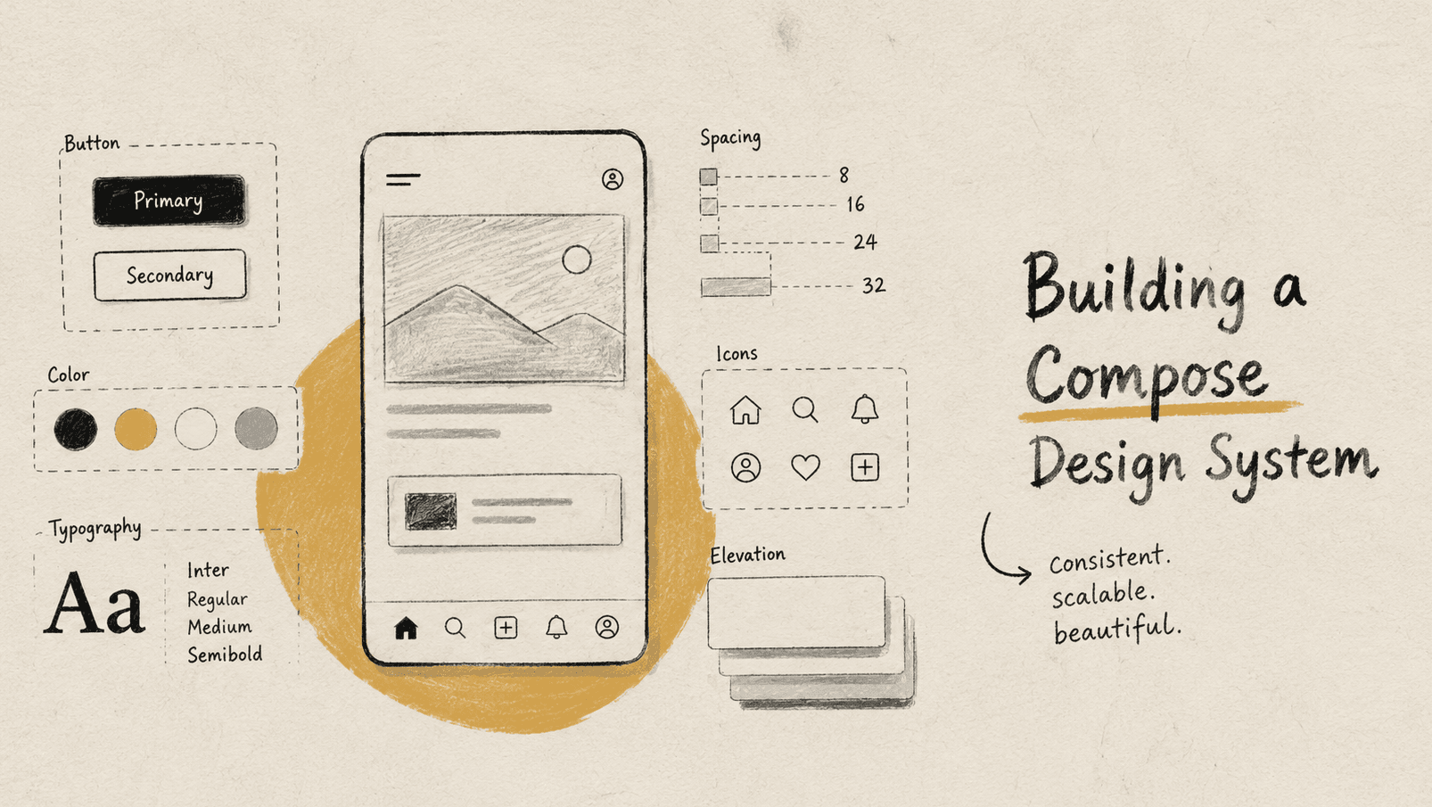
NexterDay Events is a KIIT event-discovery app: browse events, filter by tag, register solo or as a team, track your registrations. None of that is unusual. What made it worth writing about is a decision I made early and stuck to for the rest of the build: almost nothing gets drawn on screen with raw Text and Box calls. It goes through a component.
That sounds like a small thing until you count the screens. Ten screens (event list, event detail, login, profile, team creation, team joining, participant form, payment) all pull from the same view/components/ tree instead of each reinventing its own card and button. This post is about how that tree is organized, what "reusable" actually meant in practice, and a specific problem I ran into while writing it: the entire app sits behind Firebase Google Sign-In, which meant I couldn't screenshot most of these components the normal way.
What You'll See
A core/ package of thirteen small, screen-agnostic components; a token layer that's really just three files (Color.kt, Type.kt, Theme.kt); one component (EventCard) that composes three others as a worked example; and real usage counts pulled from the codebase, not estimates.
Tech Stack: Kotlin, Jetpack Compose, Material 3, Coil, Hilt.
The Shape of the System
view/components/ isn't one flat folder. It's split by who's allowed to depend on what:
view/components/
├── core/       # screen-agnostic. buttons, cards, badges, shimmer, bars
├── detail/     # used only by the event detail screen
├── home/       # used only by the home/discovery screen
├── login/      # used only by login
├── profile/    # used only by profile & team-member forms
└── team/       # used only by team creation/joining
That top folder is the actual design system: PrimaryButton, EventCard, FilterChip, TagBar, DateCard, EventStatusBadge, TopBar, Header, ReloadCard, BottomRegistrationBar, and the shimmer trio (ShimmerComponent, ShimmerImage, ShimmerEffectModifier). Nothing in it knows which screen it's on. EventCard doesn't know if it's rendering inside the home carousel or the profile screen's "your events" list. It just takes an eventName, a venue, an imageUrl, and draws itself.
Everything else is allowed to be specific: EventRegistrationBottomBarControl knows about registration state machines, ProfileCard knows about the logged-in user. The rule I held myself to: if a component's props reference EventDetail, Team, or Participant directly, it doesn't belong in the shared layer, no matter how visually generic it looks.
The Token Layer
Three files carry the entire visual identity. Color.kt is a flat list of named constants: Purple, DarkBlack, LightBlack, Gray, Green, Yellow, Red. No theming abstraction beyond that, because the app only ever renders in dark mode:
// ui/theme/Color.kt
val Purple = Color(0xFF7161EF)
val White = Color(0xFFFFFFFF)
val LightGray = Color(0xFF9C9B9F)
val DarkGray = Color(0xFF1E1E20)
val LightBlack = Color(0xFF141118)
val DarkBlack = Color(0xFF0F0C13)
val Red = Color(0xFFEC766F)
val Yellow = Color(0xFFB88C11)
val Green = Color(0xFF689F38)
Type.kt loads a custom font family, Metropolis, once, and maps it across every slot in Material 3's Typography. displayMedium, bodyMedium, titleSmall, headlineMedium, and so on each get an explicit fontFamily, fontWeight, fontSize, and letterSpacing. No component picks its own font weight from thin air; it pulls MaterialTheme.typography.titleSmall and gets Metropolis SemiBold at 18sp, guaranteed identical everywhere that slot is used.
Theme.kt is where it all gets wired into a NexterDayEventsTheme composable: a single darkColorScheme, always applied, plus the system-bar edge-to-edge setup:
@Composable
fun NexterDayEventsTheme(content: @Composable () -> Unit) {
    val colorScheme = DarkColorScheme // always dark
    // ...edge-to-edge status/nav bar setup...
    MaterialTheme(
        colorScheme = colorScheme,
        typography = Typography,
        content = content
    )
}
Every screen and every preview wraps itself in this one function, and that's the entire theming surface area of the app.
Composing EventCard
EventCard is the component that shows up most often across the app, and it's a good example of what "composing the design system" actually looks like in this codebase, because it doesn't draw much itself. It delegates:
@Composable
fun EventCard(
    eventName: String?,
    eventStartDate: String?,
    eventEndDate: String?,
    societyName: String?,
    imageUrl: String,
    venue: String?,
    onClick: () -> Unit = {},
) {
    Column(/* ... */) {
        Box {
            EventImage(imageUrl) // wraps ShimmerImage

            if (eventStartDate != null && eventEndDate != null) {
                EventStatusBadge(
                    fromDateTime = eventStartDate,
                    toDateTime = eventEndDate,
                    modifier = Modifier.align(Alignment.TopEnd).padding(12.dp)
                )
            }
        }
        Row {
            eventStartDate?.let { date ->
                DateCard(isoDateTime = date, modifier = Modifier.padding(16.dp))
            }
            Column {
                // event name, venue, society name: plain Text, styled from the theme
            }
        }
    }
}
Three shared components in one: ShimmerImage handles the network image and its own loading state, EventStatusBadge reads the two ISO timestamps and decides Live/Upcoming/Ended on its own, DateCard formats the day-of-week/day/month block. EventCard itself never touches a date-parsing function or a network client. It just arranges three components that already know how to do their jobs.
The same pattern shows up in BottomRegistrationBar, which composes PrimaryButton up to three times in a single render (solo-event register button, or team "Create"/"Join" pair) plus TicketPrice, switching which combination it draws based on maxTeamSize and registration status. The bar itself holds the decision tree; PrimaryButton never needs to know it's being reused three different ways in the same screen.
Reuse, Counted
It's easy to claim a component library is "reusable." Here's what grepping the codebase for actual call sites turned up:
| Component | Used in |
|---|---|
TopBar | 8 screens (every screen except the two loading-only auth screens) |
PrimaryButton | 6 screens + BottomRegistrationBar + DialogBox |
ShimmerImage | EventCard, ProfileCard, EventDetailBody, ParticipantFormScreen |
ReloadCard | 4 screens' error states |
EventCard | Home carousel, event list, profile's "your events" |
ShimmerComponent | 4 different loading-skeleton composites (EventDetailLoading, EventCarouselLoading, EventPopularLoading, EventUpcomingLoading) |
TopBar alone accounts for every top app bar in the entire app: one 40-line file deciding what every screen's header looks like. Change the containerColor there once, and eight screens change together instead of eight screens needing eight separate edits, which is really the entire pitch for building this layer in the first place.
Making It Previewable
Here's the part that turned into its own small project. AppNavigation gates the entire app behind Firebase auth:
val isUserLoggedIn = Firebase.auth.currentUser != null
val startDestination = if (isUserLoggedIn) "main" else "login_graph"
Which means the only way to actually see most of these components rendered was to run the full app, sign in with a real Google account, and navigate to the right screen, every time I wanted to check whether EventStatusBadge picked the right color, or whether BottomRegistrationBar laid out correctly for a team event versus a solo one. Out of roughly thirty components in the tree, only three (GoogleOneTapButton, TeamIdClipboard, TeamMemberItem) had a Compose @Preview. The rest had never been looked at outside the running app.
So that shared layer got a pass: an @Preview function for each component, wrapped in NexterDayEventsTheme so colors and typography match the real app, seeded with realistic sample data instead of empty strings. Here they are in the same order they were introduced back in The Shape of the System, starting with the plainest atom and building up to the compositions:
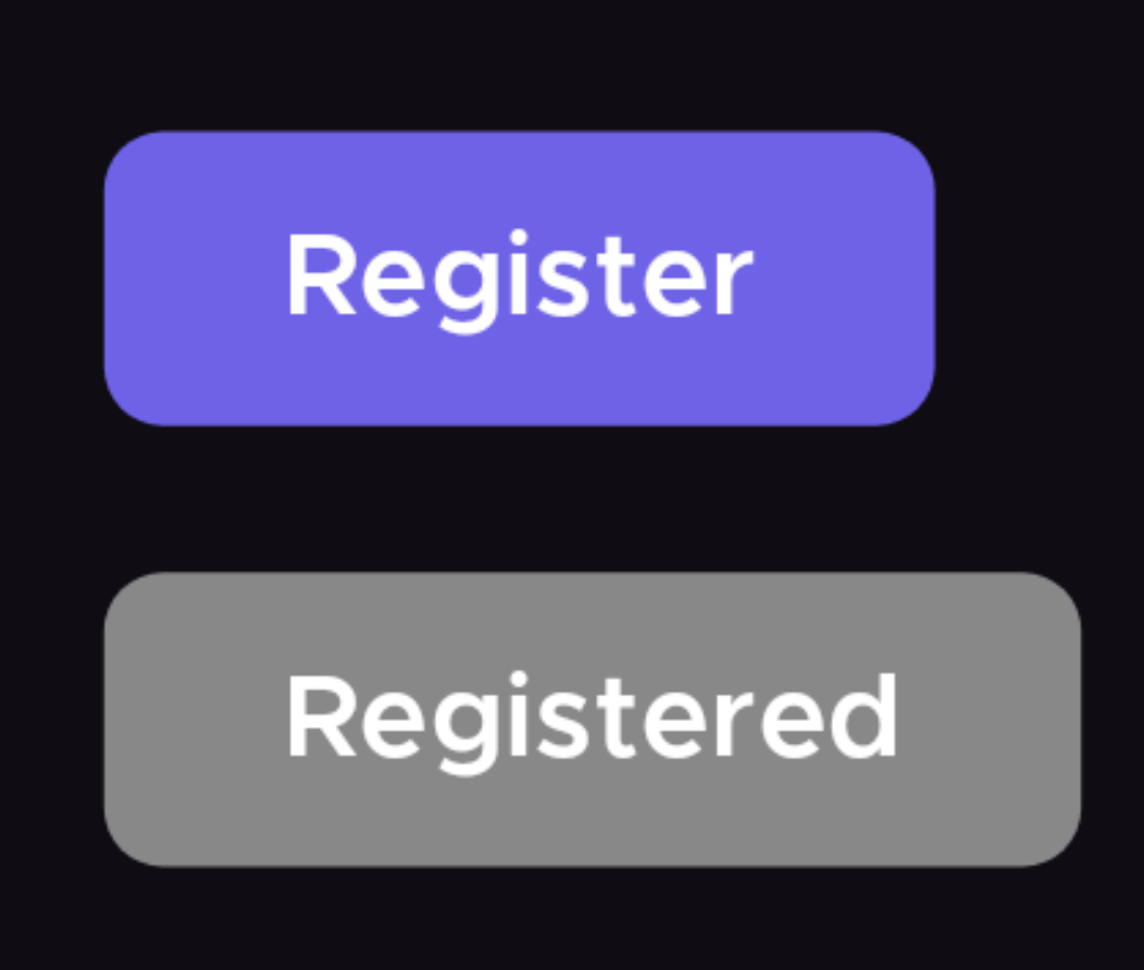
Figure 1. PrimaryButton, enabled and disabled.

Figure 2. FilterChip, selected and unselected.
TagBar composes a scrollable row of FilterChips, and it needed actual state, not just props, since it owns which tag is selected. The preview declares its own remember { mutableStateOf(...) } and feeds it back through onTagSelected, so it's genuinely interactive in Android Studio's preview pane, not just a static frame:

Figure 3. TagBar, with its own local remember state driving the same onTagSelected callback the real screen uses.
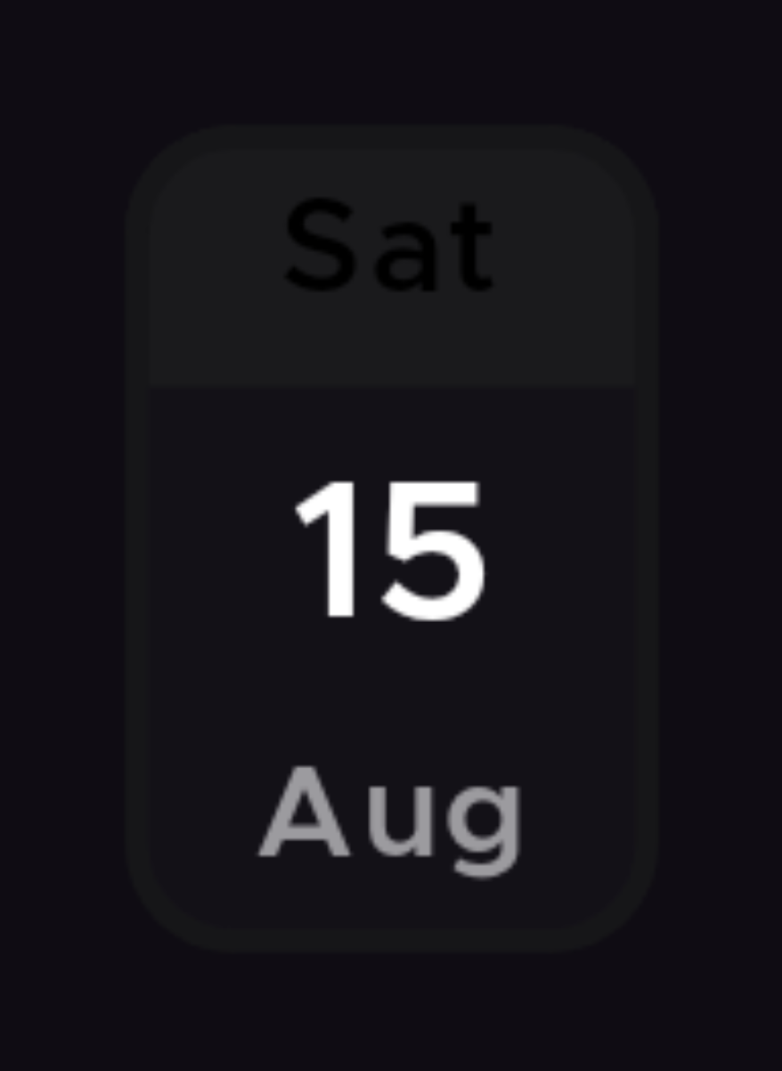
Figure 4. DateCard, formatting an ISO timestamp into three lines.
EventStatusBadge needed more thought than a sample string. It picks Live/Upcoming/Ended by comparing two ISO timestamps against the device's actual current time, so a preview hardcoded to "today" would silently start rendering the wrong badge the day after I wrote it. The fix was to make the "Live" sample span a deliberately absurd range, 2020 to 2030, so the preview stays correct regardless of when someone opens it:
// Live: a wide window guaranteed to contain "now" whenever this preview is viewed
EventStatusBadge(fromDateTime = "2020-01-01T00:00:00Z", toDateTime = "2030-01-01T00:00:00Z")
Figure 5. All three states, deliberately impossible to render wrong regardless of when this is viewed.
EventCard, the component from the case study above, composing ShimmerImage, EventStatusBadge, and DateCard, got the same treatment, with one wrinkle worth its own explanation:
@Preview(showBackground = true, widthDp = 220)
@Composable
private fun EventCardPreview() {
    NexterDayEventsTheme {
        Surface(color = DarkBlack) {
            EventCard(
                eventName = "KIIT Fest 8.0",
                eventStartDate = "2025-02-14T04:30:00Z",
                eventEndDate = "2025-02-16T14:30:00Z",
                societyName = "IoT Lab, KIIT",
                imageUrl = "android.resource://in.iotkiit.nexterdayevents/drawable/kiitfest_poster",
                venue = "KIIT Campus"
            )
        }
    }
}
The imageUrl there isn't https://. It's android.resource://in.iotkiit.nexterdayevents/drawable/kiitfest_poster, Coil's URI scheme for loading a bundled drawable. Static preview rendering in Android Studio frequently can't resolve real network calls, so a picsum.photos URL was rendering as a stuck shimmer more often than an actual photo. Dropping the real KIIT Fest poster into res/drawable/ and pointing at it locally fixed that for good. The preview is deterministic and offline, and it happens to also look like the real app instead of a stock photo standing in for one.

Figure 6. TopBar, one file behind every header in the app.

Figure 7. ReloadCard, the same error state, reused across four screens instead of rebuilt four times.
Last, BottomRegistrationBar, the other composition from the case study, reaching for PrimaryButton up to three times, got two previews stacked in one, solo-event and team-event, because those two branches produce visually distinct layouts and a single sample wouldn't have shown both:

Figure 8. The solo-event branch.

Figure 9. The team-event branch, same component, same file, different props.
Every one of those checks out against the real, logged-in app too, not just in isolation:
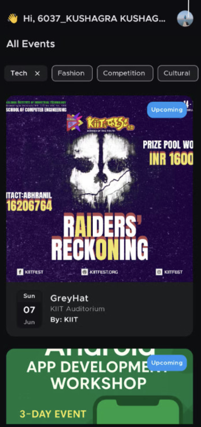
Figure 10. EventCard, TagBar, and FilterChip running against live data, not a mockup.
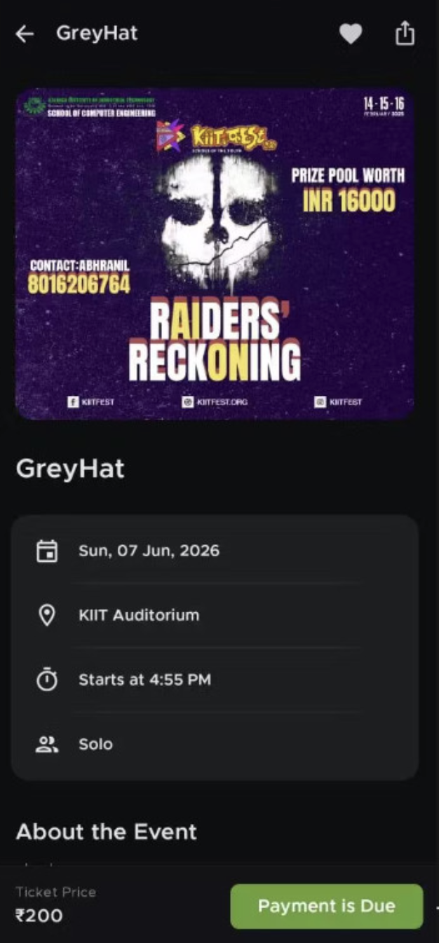
Figure 11. Solo event, registered but unpaid: the green "Payment is Due" branch from BottomRegistrationBar's color logic, matching Figure 8.
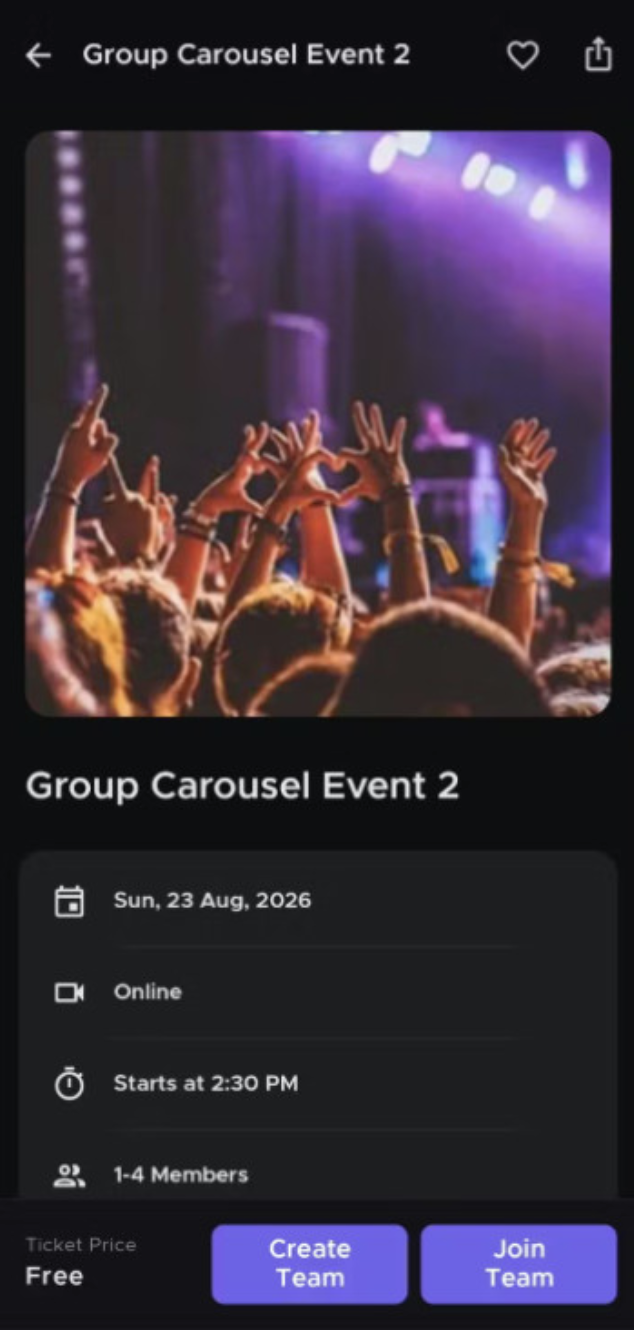
Figure 12. Team event, no team yet: the exact branch shown in Figure 9, now with live data.
None of this changed how the app behaves. It's purely a development-time addition, twelve small preview functions, none of them shipped any differently in a release build. But it turned "does this component look right" from a question that required a Google sign-in and three taps of navigation into one that's answered by opening the file.
The interesting part of this design system was never any single component: PrimaryButton is twenty lines, Header is nine. It's that the split between the shared layer and everything else held up over ten screens without needing exceptions, and that composition happened naturally once the pieces existed: EventCard reaching for ShimmerImage and EventStatusBadge and DateCard wasn't a deliberate architectural moment, it was just the obvious way to build it once those three already existed and did their jobs.
The full source is on GitHub.
if this made you think, you might enjoy something from the library.